How a simple logo change led to a complete website rebrand
 Website Brief
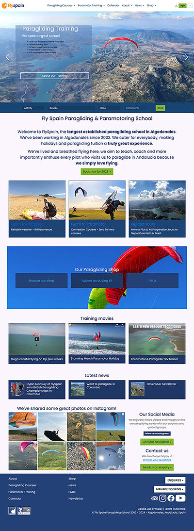
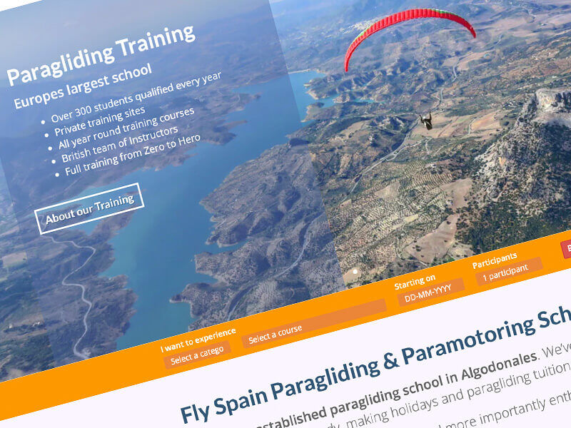
When Fly Spain decided to change their primary colour to blue, this required a complete review of their orange-based six-colour palette, which had various uses on the website. Recognising that mobile visitors now constitute over 55% of traffic, it was time to rethink the page layout and content structure to improve the user experience. Simplifying the messaging necessitated rethinking the colour application, making it the perfect opportunity for a comprehensive website overhaul.
Project Deliverables
Colour Change Impact
With simplification as the main driver, a complete shake-up of the global template was necessary, followed by a review of all key pages on the website. The site had become overwhelming, with content continuously being added over the years. It was time to step back and review the overall impact.
Focusing on Mobile Experience
To simplify the content messaging, we focused on the footer area, which had become quite content-heavy over time. Being a global element, reducing the footer content would decrease page height across the entire site, particularly on mobile devices.
Collaborative Redesign Process
By collaborating with the customer using Figma and CreativeCMS, we were able to take a fresh duplicate of the site and apply drastic changes to the page layouts. This allowed us to review and refine ideas with the customer effectively. Another significant contributor to page height on mobile was the use of right sidebars on the desktop view, which wrapped under the main content on mobile.
The Result
- Improved User Experience: The new colour palette guides users more efficiently through the site, especially on mobile devices.
- Enhanced Content Management: Additional features simplify style management for commonly published content.
- Modernised Functionality: Updating the site to Bootstrap 5 (BS5) quickly enhanced existing functionality, contributing to the website’s contemporary feel.
Conclusion
The redesign successfully simplified and modernised Fly Spain's website, improving user experience across all devices. Future updates will continue to refine and enhance the site’s functionality and aesthetic.
SolvIt have been helping us since we first started. It's been refreshing to have a working relationship that's mutually interested in our success as we are and not just about selling us a service. SolvIt have offered advice and caution when planning our website, made a real effort understanding our needs and that of our market. Not concerned with flashy upgrades necessarily but content, functionality and realtime Market response.
SolvIt have been responsive to our needs and experimental ideas offering only sound advice on a practical level and brilliantly patient with our Internet learning curve. Many companies pitch each year for our business but the SolvIt team have always delivered results which is fundamentally keen to our bottom line. Having SolvIt as our web manager is like having real skills and expertise on hand only when you need it. We can't praise them enough!
Rob Mansley
Business Owner

Related

Flying high with their new look mobile responsive website design
In identifying a significant increase in their customer’s viewing audience the Fly Spain’s website needed to cater for mobile visitors more efficiently.

Does my website need a CMS to succeed?
If you’re anticipating your website to contribute to the growth of your business, then yes, absolutely!
