For a Project that’s run Outdoors, all bookings are handled in the dry!
 Website Brief
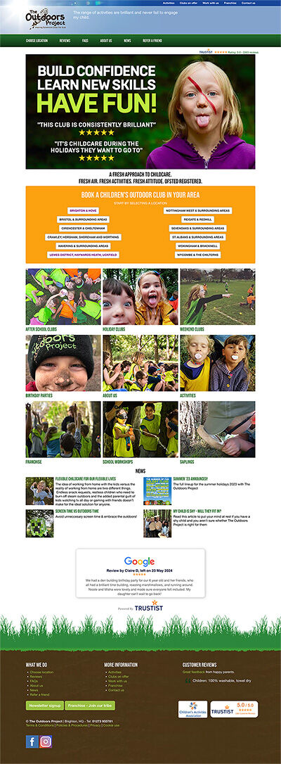
The Outdoors Project needed to simplify the management of bookings for new customers, while also catering to existing customers through a single customer journey was required.
Improve the general User Experience (UX) particularly on mobile, by simplifying the page layout and standardising the content published.
Standardise the content published across each franchise in preparation for the growth plans of The Outdoors Project.
Project deliverables
It was a real challenge to invent a single process creating the same experience for new and existing customers, working within the current restraints of certain design features.
But, after much deliberation we've developed a process that should cater for both parties equally well. It’s certainly a huge improvement on the existing usability.
We’ve culled a lot of content and simplified the page layout to focus the users’ attention when browsing the site, encouraging course bookings. Particularly on mobile devices.
In standardising the content published across each franchise, more frequent updates can be made to general content across the board keeping things consistent.
The Result
We’ve created an intuitive booking journey that caters equally to both customers, new and existing being a key requirement for this project.
The website is structured in a fashion that new franchises’ benefit from all existing ’SEO love’ gained from the company's exceptional existing search results.
The website is well poised for the next stage of The Outdoors Project’s growth.
Related

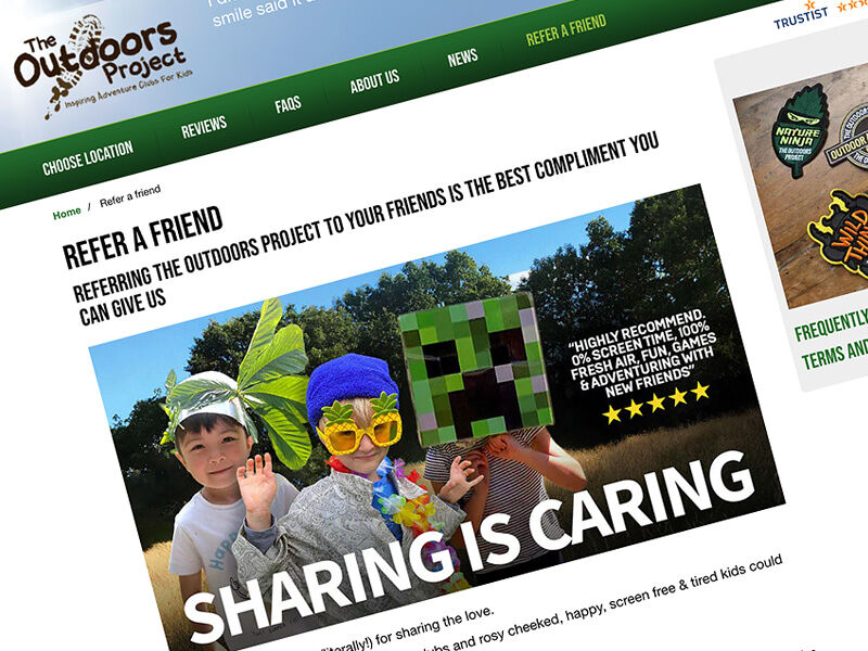
Referral Service proves to be a huge success with customers
Autimated Markeing proves to be a roaring success for The Outdoors Project generating a new passive income stream

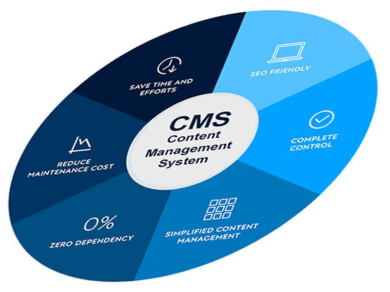
Does my website need a CMS to succeed?
If you’re anticipating your website to contribute to the growth of your business, then yes, absolutely!
